
I recently shared my current iPhone home screen over in the MacSparky Labs, and it generated a lot of interesting responses accusing me of both genius and madness. Let me explain…
The default tools for managing the iPhone home screen are fine, and I’ve used them for years. But in my never-ending quest for increased intentionality, I started to wonder—what if I took some of the sexiness out of the iPhone home screen?
You’ve probably heard about these minimalist or “distraction-free” phones gaining popularity—devices designed to help people focus more clearly by stripping away smartphone features and distractions. While I get the appeal, giving up all the power of the iPhone for that seems like overkill. So I started wondering, “Can I just tame the iPhone instead?” What if I made a few strategic tweaks to reduce distractions but kept all the power under the hood?
That idea led me to this: a home screen that’s intentionally boring but wildly useful.
This layout was built using David Smith’s Widgetsmith, Apple Shortcuts, and a few clever design tricks.
Breaking Down the Home Screen
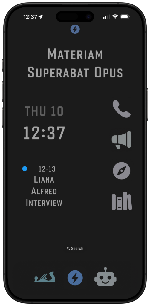
Top Widget
At the top is a medium-sized Widgetsmith widget that I’ve customized with a Latin phrase: Materiam Superabat Opus, which roughly translates to “the workmanship exceeded the materials.” I love the idea of making the most out of what you’ve got. It’s how I try to live, and frankly, it’s what I hope they say about me someday. “He did a lot with what he had.”
Also, above that widget is a green image of a hand plane. That icon changes depending on my current Focus Mode. If I’m in Personal Focus Mode, the hand plane appears. If I switch to MacSparky, it becomes a blue MacSparky logo. I use the same logo at the bottom as a launcher for MacSparky-specific shortcuts.
Left Side: Date and Event
Here you’ll see:
- A date and time widget from Widgetsmith.
- A “next event” widget, also from Widgetsmith, showing my upcoming calendar item.
These keep me grounded without flashing red badges or noise.
Right Side: App Launchers via Shortcuts
Instead of traditional app icons, I use custom Shortcuts with icons pulled from Apple’s SF Symbols library. Each one is purposeful:
Phone – A simple shortcut that launches the Phone app.
Communications Button (Megaphone Icon) – A “Choose from Menu” shortcut that lets me select from various communication methods: Messages, Slack, Discord, Mail, and a few others. (For the uninitiated, “Choose from Menu” is a Shortcuts action that lets you build a custom list of options. Each option can launch a different app or action. It’s not difficult and, I cover it at length in the Shortcuts Field Guide.)
Here’s the key: I don’t see message badges. I could have ten unread texts and not know it until I deliberately tap the megaphone, then Messages. That’s not a bug—that’s a feature.
Safari – A direct shortcut to launch Safari.
Reading & Writing – Another “Choose from Menu” shortcut. This one lets me write (Drafts, Day One, Notes) or consume (Readwise, Unread, eBooks, Substack).
The Dock
Hand Plane (Personal Context) – This launches a personalized “Choose from Menu” shortcut. I’ve mapped out all the things I routinely do in my personal life—check a personal task list, jump into a personal project note, etc.—and launch them directly as actions, not apps. This all ties into my idea of contextual computing. I don’t want to launch apps; I want to do actions with my device. By building custom shortcuts for specific actions, it avoids a lot of distraction.
MacSparky Logo (MacSparky Context) – Similar to the above, but for MacSparky work. If I get an idea for the MacSparky Labs or want to update a Mac Power Users outline, I tap this and immediately drop the thought in the right place. I’ve got a full suite of MacSparky-related tools under that button.
Robot Head (AI Tools) – This is my shortcut hub for AI experiments. I’ve been using all the big frontier models, and I’m also testing smaller tools like Whisper Memos (for voice note transcription) and Cleft (for AI meeting and task summaries). I’m using them enough that they got a dock icon. Appropriately, I built that icon with ChatGPT.
The Magic Trick: Disappearing Dock
A big part of what makes this screen feel quiet is a simple trick: I sampled the dark gray color of the iPhone’s dock in Dark Mode. The hex code is #242424. Once I had that, I:
- Set my wallpaper to the exact same color
- Set the Widgetsmith widget backgrounds to match
- Gave my custom icon backgrounds the same color
The result? Everything blends together into one flat, uniform canvas. The dock “disappears,” the icons don’t pop, and nothing screams for attention.
There are no notification badges or color distractions. The only thing that draws my eye is the next appointment text. That’s by design.
Final Thoughts
I’m really digging this home screen. It’s super boring—on purpose—but still incredibly functional. I get all the utility of an iPhone without the endless dopamine buffet.
I know the rumors are swirling that Apple might revamp the home screen experience this year with something new and flashy. I’ll be tempted to try it, of course. But for now, this quiet, intentional home screen speaks directly to my heart.
If you’d like to build something like this, here’s a link to a video I recorded in the MacSparky Labs. It’s the kind of thing we do in there all the time. If you’re not yet a member and want to join, use the code BORINGHOMESCREEN to get 10% off—but fair warning, it’s only good for a week. Also, I’m planning on publishing more public YouTube content, so you may want to subscribe to my YouTube Channel.