I’ve made no secret of my dissatisfaction with the Apple Watch faces. As someone who wears an Apple Watch every day, I can tell you things I don’t like about every available watch face. I’m not alone in the sentiment. Zac Hall wrote an article over at 9to5 Mac arguing that Apple needs to give users more customization to the existing Apple Watch faces. Amen.
I agree with everything Zac wrote, but I also have a few additional points from a fifty-plus-year-old nerd.
Complications Need to Become Easier to Read

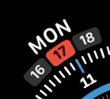
For instance, the current corner date complication puts the day of the week in large text and the day of the month in small text. Why? Most people that need the date on their watch need the day of the month. Also, why not an option with an even bigger number that is the day of the month and forego the day of the week altogether?

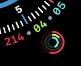
Another example is where they put in small bits of text in a complication in addition to an icon, like the Activity Rings. I like complications, but I feel like the inclusion of the exact count for each ring on the face isn’t necessary. Why not an option with just rings?
Watch Hands
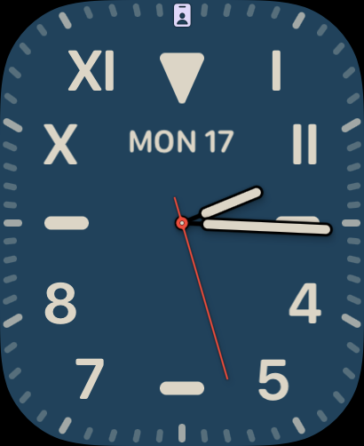
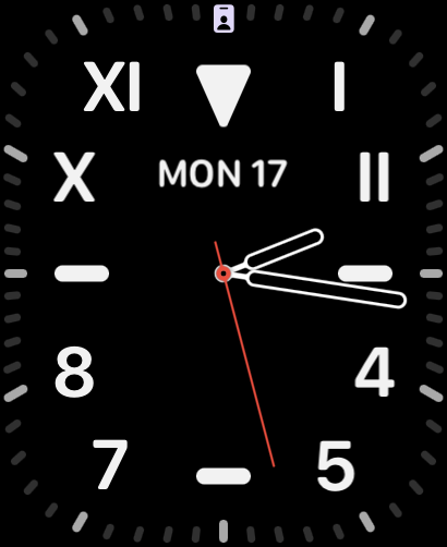
Many faces have hands that blend into the background. For example, most of the color variations of the California face have hands that are the same color as the background. When you want to check the time but have to spend time trying to find the hands on your watch, that’s bad. There are exceptions in the California face, like Navy Blue (pictured), but they should all have at least an option to be this readable.


Making more customizable Apple Watch faces seems like such low-hanging fruit that it baffles me why Apple hasn’t done it yet. I fully realize the “get off my lawn” tone this article sets, but it seems like every new iteration makes reading watch harder for anyone over 25. If Apple gave users more granular controls over watch faces, we could build faces we’d like a lot more.
