
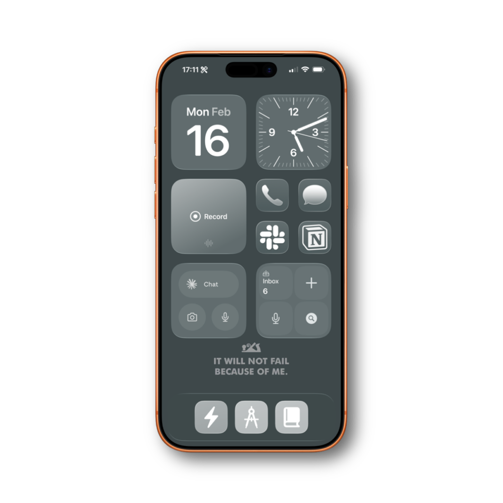
When it comes to my home screen, I don’t like to show too many apps. I prefer to work in context instead of apps. So those context shortcuts in my dock do a lot of the heavy lifting. While on this quest to banish apps from my home screen I tried to hide my communication apps behind Shortcuts action buttons…
… and I failed.
The idea was clean. Messages, Slack, and Notion don’t need to sit on my home screen. I can tuck them under a contextual menu in my dock. Fewer icons, less visual clutter, less temptation to check things compulsively. In theory, perfect.
In practice, I forgot people existed.
My editor for Mac Power Users sent me a message about something he needed fixed. I didn’t see it for a day and a half. Not because I was busy. Because I never tapped the button. Without the little red badge staring at me from the home screen, I just… didn’t think about it.
So now I have four apps on my home screen. Phone, Messages, Slack, and Notion. They’re there specifically because they show badges. That’s their entire purpose on my screen. I would prefer to hide them. I am not disciplined enough to check them otherwise.
A Labs member offered a middle ground I hadn’t considered. He puts his communication apps inside a folder, along with shortcut icons for speed-dialing specific people. Tap the folder, see all your communication options plus one-tap calling for the people you talk to most. The folder still shows a badge, so you know something needs attention. And you consolidate everything into a single spot.
I tried this and ran into a different problem. A folder badge tells you something needs attention. It doesn’t tell you what. When I see a badge on Slack, I know it might be my team and I should deal with it now. A badge on Messages can wait until tonight. A folder badge? I’d tap it, see it was just a text from my sister, and feel like I wasted a context switch. Besides all that, the folder on my home screen is ugly and I just couldn’t get used to it.
If you can live without that distinction, this approach is worth trying. You get the badge reminder with less home screen clutter.
Another option is persistent notifications. They stick on top of the home screen until you deal with them. But I know that would last for about 10 minutes before I’d just dismiss and forget about them. Know thyself.
So at the end of the day, my communication apps sit on the home screen. It’s not the minimalist dream I wanted. But I’ve learned something about myself through this process. My systems have to account for how I actually behave, not how I wish I behaved. I’m not the guy who checks his messages on a schedule. I need the visual nudge.
If you’re more disciplined than me, hide them. If you’re like me, give them a spot on the screen and move on. There are more productive things to feel guilty about.