Widgetsmith Wallpaper Shine Through

Widgetsmith 8.2 just shipped, and it brings a feature I’ve been wanting. Your widgets can now go clear or frosted, letting your wallpaper show through.

Old-school Widgetsmith users will remember the trick. You’d screenshot your wallpaper, feed it into the app, and Widgetsmith would generate a background for each widget that perfectly matched whatever sat behind it. No visible borders. The widget just disappeared into your wallpaper. It was clever and it looked fantastic.

Then Apple added the shadow box around widgets, and that trick stopped working. You can’t fake invisible edges when iOS draws a visible container around every widget on your Home Screen.

Widgetsmith 8.2 is the answer to that. It’s not the same seamless blend we used to have, but it’s as close as we’re going to get. Your widgets can now be clear or frosted, so your wallpaper actually shows through instead of being covered by an opaque box.

The update also adds photo backgrounds. You can put any image behind your widgets. Family photos behind a clock widget. Your dog behind the weather. A favorite pattern behind your calendar. It’s a nice touch for people who want their Home Screen to feel more personal.

If you care about how your iPhone looks (and if you’re reading this, I suspect you do), grab the Widgetsmith 8.2 update. David Smith and his team keep finding ways to give us the customization that Apple won’t.

Home Screens: Dave Myhre

Today I’m featuring the home screen of my pal Dave Myhre. Dave, a former jet pilot and current Christmas Tree farmer, is one of the most thoughtful technology users I know. He’s the kind of guy who actually thinks about why he sets things up a certain way, not just how. He’s also been busy planting trees, which tells you something about his priorities. So Dave, show us your home screen.

What are some of your favorite apps?

Obsidian — I like writing my notes in markdown and keeping everything stored locally. I wish it had a native Mac app, and I really wish it had usable iOS and iPadOS versions. On mobile devices, I only use it to view notes. If notes need to be shared, I’ve switched to Apple Notes.

Paprika is my go-to for meal planning, recipe management, and shared grocery lists. I really enjoy Paprika’s ability to capture recipes from the web. Sharing recipes in Paprika is also very easy. Last year, I spent time entering some of my Mom’s recipes into Paprika and even attached pictures of her original 3×5 recipe cards. I was able to share the recipes with family members either as a Paprika file or a PDF.

Focus Modes, although technically not a stand-alone application, has given me back control of my attention and focus when using my devices. I’m down to two key focus modes: Normal and Deep Work. Normal limits notifications to a select group of people and a very short list of applications, and it allows calls only from known contacts. Everything else shows up in scheduled notifications that display about every four hours. Now, when my phone sends a notification, it’s probably important to me, and I don’t feel bad about checking it. My Deep Work focus mode allows notifications only from my wife and my emergency bypass contact. All other calls and notifications show up in the scheduled notifications.

What app makes you most productive?

I have a bunch of pokers in the fire. Quite honestly, too many. The only way I keep from getting burned is by maintaining a robust task management system. I’ve found pairing OmniFocus with Reminders to be a powerful combination. My projects and personal tasks live in OmniFocus, and my shared tasks live in Reminders. Having two task management applications is not the ideal solution. To keep things straight between the two, I use a simple rule to decide where the task will live. If it’s a shared task, it’s handled in Reminders; otherwise, it’s managed in OmniFocus.

What app do you know you’re underutilizing?

Drafts — it’s my capture tool of choice. Almost everything starts in Drafts. Unfortunately, I rely too heavily on cut-and-paste to get things out of Drafts. The actions library in Drafts is excellent. I really need to pick a few actions and get those under my fingers. (Dave, I can help with that.)

Which app is your guilty pleasure?

Solitaire by MobilityWare. It’s simple and easy to start and stop, even in the middle of a game. And of course, I never play it in Game Center. It’s called Solitaire for a reason.

If you were in charge at Apple, what would you add or change?

Add deep link support to Notes, Reminders, Files, and Photos. There is some support now, but system-wide deep link support would be nice.

Fix Siri. Enough said. (Amen, Dave.)

What’s your wallpaper and why?

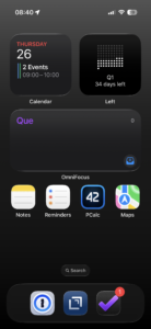
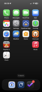
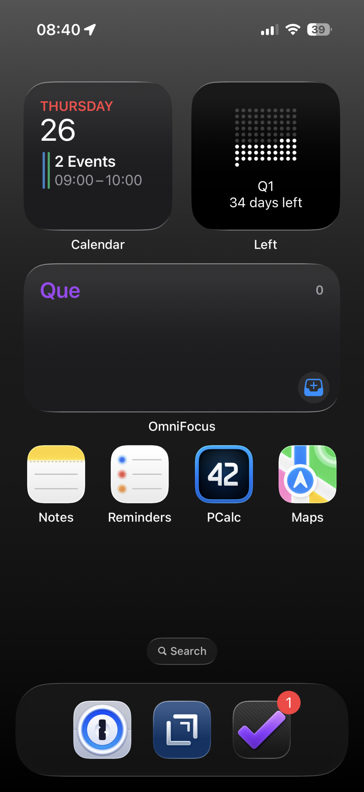
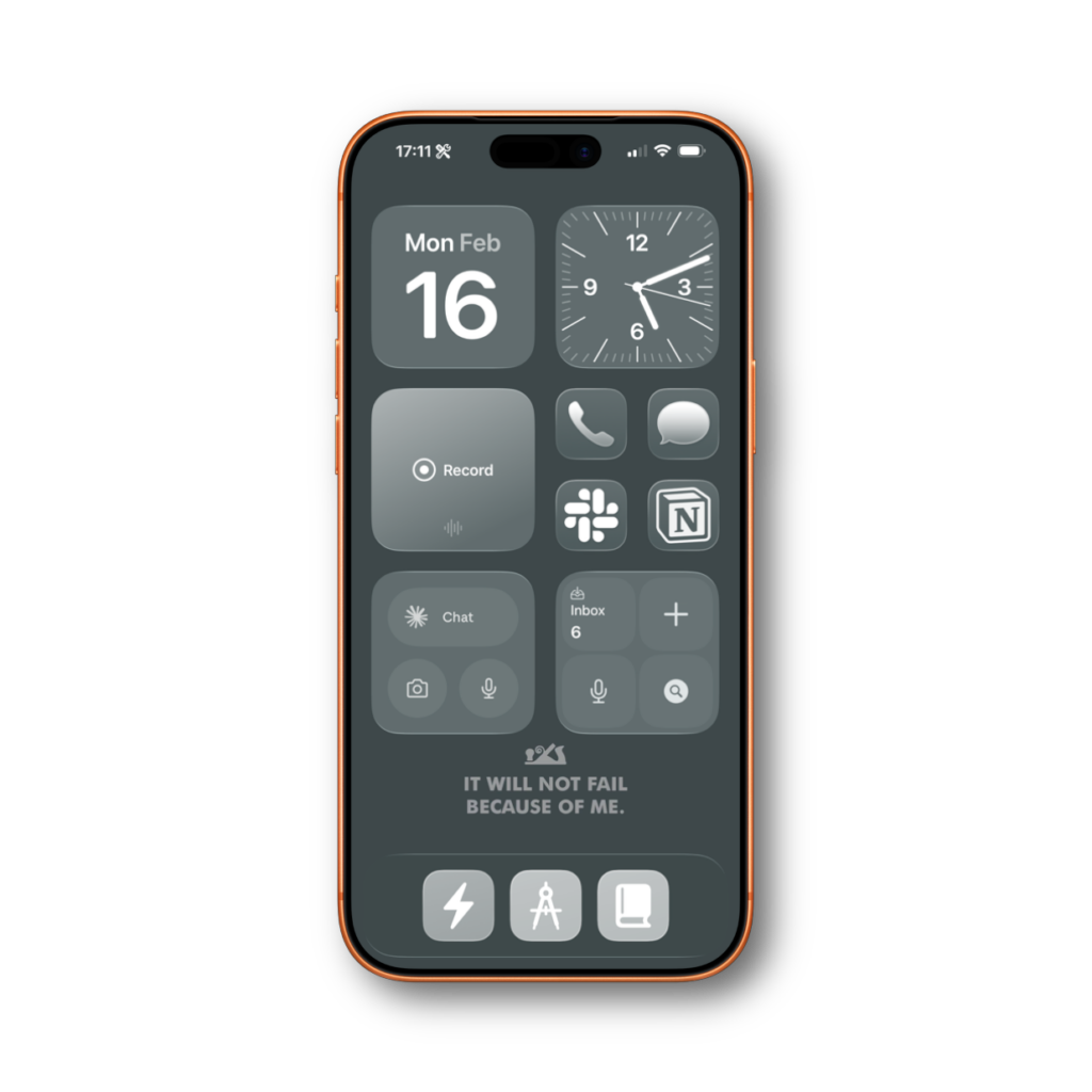
Just the stock black background that has a slight gradient from dark gray to black. It’s boring and simple, but I like it. I’ve also removed most of the icons from my home screen. I use the Calendar and OmniFocus widgets to keep tabs on what’s going on. I also use the Left widget to graphically show the days remaining in the current quarter. Only a handful of apps live on my home screen. Notes, Reminders, PCalc, 1Password, Drafts, OmniFocus, and Maps. The Phone, Messages, FaceTime, and Mail applications live on the second page, along with a short list of other key applications. Slowly, I’ve been removing the other applications from the remaining screens, since searching for them works fine when I need them.

Thanks, Dave!

Apple’s Big Hardware Week

Apple kicked things off today with the iPhone 17e and a refreshed iPad Air powered by M4. Both look like solid updates. The iPhone 17e brings the A19 chip and doubles the base storage to 256GB while keeping the same $599 starting price. The iPad Air gets the M4 with more memory and a faster Neural Engine. Pre-orders for both start Wednesday.

But the announcement I’m most excited about is the new budget MacBook, expected later this week. A low-cost Mac laptop could open the platform to a whole new group of users. People who’ve been priced out of the Mac or stuck on Chromebooks will finally have an on-ramp. That’s good for them and good for the platform. I’ll have more to say once Apple makes it official.

Nobody Can Make Fun of Phone Cameras Anymore

I was sitting in the dark of my backyard last night, admiring the planets, as you do, when I noticed a blob of something in the tree looking down at me. My distance vision is 20/20, yet I still could not make it out. I pulled out my iPhone and used the 5x lens in dark mode. It kept the shutter open for a few seconds and returned this image.

The Red Badge Won

When it comes to my home screen, I don’t like to show too many apps. I prefer to work in context instead of apps. So those context shortcuts in my dock do a lot of the heavy lifting. While on this quest to banish apps from my home screen I tried to hide my communication apps behind Shortcuts action buttons…

… and I failed.

The idea was clean. Messages, Slack, and Notion don’t need to sit on my home screen. I can tuck them under a contextual menu in my dock. Fewer icons, less visual clutter, less temptation to check things compulsively. In theory, perfect.

In practice, I forgot people existed.

My editor for Mac Power Users sent me a message about something he needed fixed. I didn’t see it for a day and a half. Not because I was busy. Because I never tapped the button. Without the little red badge staring at me from the home screen, I just… didn’t think about it.

So now I have four apps on my home screen. Phone, Messages, Slack, and Notion. They’re there specifically because they show badges. That’s their entire purpose on my screen. I would prefer to hide them. I am not disciplined enough to check them otherwise.

A Labs member offered a middle ground I hadn’t considered. He puts his communication apps inside a folder, along with shortcut icons for speed-dialing specific people. Tap the folder, see all your communication options plus one-tap calling for the people you talk to most. The folder still shows a badge, so you know something needs attention. And you consolidate everything into a single spot.

I tried this and ran into a different problem. A folder badge tells you something needs attention. It doesn’t tell you what. When I see a badge on Slack, I know it might be my team and I should deal with it now. A badge on Messages can wait until tonight. A folder badge? I’d tap it, see it was just a text from my sister, and feel like I wasted a context switch. Besides all that, the folder on my home screen is ugly and I just couldn’t get used to it.

If you can live without that distinction, this approach is worth trying. You get the badge reminder with less home screen clutter.

Another option is persistent notifications. They stick on top of the home screen until you deal with them. But I know that would last for about 10 minutes before I’d just dismiss and forget about them. Know thyself.

So at the end of the day, my communication apps sit on the home screen. It’s not the minimalist dream I wanted. But I’ve learned something about myself through this process. My systems have to account for how I actually behave, not how I wish I behaved. I’m not the guy who checks his messages on a schedule. I need the visual nudge.

If you’re more disciplined than me, hide them. If you’re like me, give them a spot on the screen and move on. There are more productive things to feel guilty about.

iPhone 17 Camera Review

Today is iPhone review release day. Hooray! Tyler Stalman’s iPhone Camera review was most interesting to me. He’s a fan. It was interesting how much he talked about the improvement to the selfie camera. For typical users, this may be the biggest win. The biggest surpise to me was the quality of the AirPods as a wireless mic for shooting video with your phone.

Why The iPhone is Getting Interesting

Apple dropped their latest batch of iPhones this week, along with new Apple Watches and an AirPods Pro update. Here’s what you need to know.

The iPhone 17 lineup brings the usual suspects with some interesting twists. The standard 17 gets some nice upgrades and features that were traditionally only on the Pro phones, like ProMotion. The 17 Pro and Pro Max got a noticeable upgrade to the cameras, and their switch from titanium to aluminum should allow the A19 Pro chip to cook without actually cooking. The Pro models finally get some personality with new color options (more on that in a minute). The oddball is the iPhone Air. It’s remarkably thin and light, but you’re giving up some camera capabilities and battery life to get there.

On the wearables front, the Apple Watch Series 11 focuses on health tracking improvements and better battery life. The new Apple Watch Ultra 3 is the notable watch release this year, getting satellite communications from your wrist, a slightly bigger screen (in the same size case), and several other iterative improvements.

The new AirPods Pro 3 bring improved noise cancellation and, hopefully, even a better fit for more people. They also added two more watch faces that appear entirely inscrutable to me. Apple’s streak of bad Apple Watch faces continues.

Here’s what really struck me about this event, though. The iPhone Air is fascinating because it’s not following Apple’s usual playbook. This isn’t a budget phone. It’s not a performance monster either. Apple’s asking people to pay premium prices for something thinner and lighter, and they’re paying with both money and features. You’re getting less camera capability than the Pro phones. Battery life won’t match the Plus models. But for some people, having a phone that practically disappears in their pocket will be worth those trade-offs.

I don’t expect the Air to be a runaway success, and that’s perfectly fine. I actually love that Apple’s making phones for different priorities now. They’re the only company making iPhones, so we only get what they give us. But at least they’re giving us more options than “big or bigger” and “expensive or more expensive”. Some folks want the absolute best camera system. Others want all-day battery life. And apparently, some people just want their phone to be as thin as possible. Good for them.

As for me? I’m going all-in on the iPhone 17 Pro Max in orange. Apple’s never offered vivid colors on the Pro phones before, and I’m here for it. After years of Space Gray and Natural Titanium, I want something with personality. My phone is with me constantly. Why shouldn’t it spark a little joy? The Air doesn’t really call out to me. I’m always going to want the most powerful iPhone with the best cameras. Also, the difference in weight between the iPhone Pro Max and the iPhone Air is 66 grams. That’s not insignificant for something you put in your pocket, yet it seems trivial to me for those additional features and battery life.

Looking ahead, the Air might be more important than it appears. Word is Apple’s been working hard on ultra-thin phone technology because next year we might see a folding iPhone. Folding phones need to be incredibly thin since a folding phone necessarily has two screens stacked together. Samsung and others have been selling folding phones for years now, and the timing feels right for Apple to jump in with its take on it.

I spend a lot of time reading on my phone, so the idea of unfolding it into a mini-tablet has real appeal. I’m already starting to save because if Apple does release a folding iPhone, it’s going to cost serious money. We’re probably looking at $2,000 or more if the current folding phone market is any indication. After years of incremental updates, we’re getting real variety in the lineup, and next year could bring the biggest form factor change since the original iPhone.

In short, the iPhone is interesting again.

Why the iPhone Air Might Actually Make Sense

It’s easy, as someone who writes about this stuff, to project our own preferences onto new products. And I’ll admit, I feel that pull strongly with the rumored iPhone Air.

As rumors continue to circulate about iPhone Air, a much thinner version of the iPhone that comes in at a higher price point than the entry-level model but not as powerful as the iPhone Pro, I can’t help but wonder: how big is the market for an expensive, skinny iPhone?

We’re now seeing mock-ups floating around, like this one on YouTube, as case manufacturers gear up. And yes, it’s definitely a lot thinner than the standard iPhone. But once you slap a case on it or even stick on an extra battery, you may very well end up holding something not noticeably different in hand from an iPhone Pro. Except now, it’s close to the Pro’s price without the Pro’s camera.

Maybe that’s the real inflection point: do you want a phone that’s slightly lighter, or one with a better camera? I suppose there’s a category of users who don’t take that many photos, or maybe never shoot video, and would gladly trade camera horsepower for something thinner and lighter.

The question (to which Apple should get an answer later this year) is exactly how many of those people are out there?