
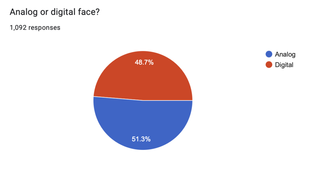
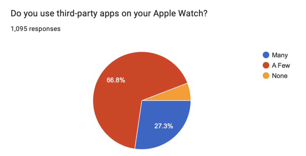
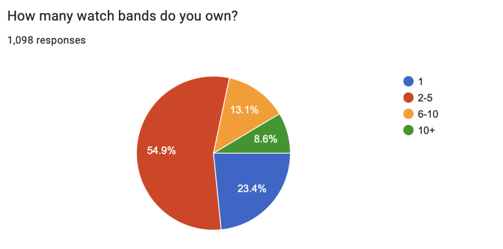
A few weeks ago, I did a survey on Apple Watch usage. I summarized the results in today’s newsletter (Sign up) along with some thoughts about how it relates to the future of the Apple Watch, but I wanted to share the entire survey results somewhere, so here you go.
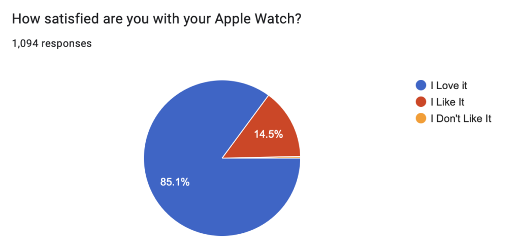
There were just under 1,100 responses. I think you can assume the responses skew a bit on the nerdy side because, well, me. But overall, the data reflects that the vast majority of folks are very happy with their Apple Watches.
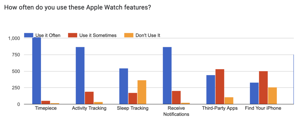
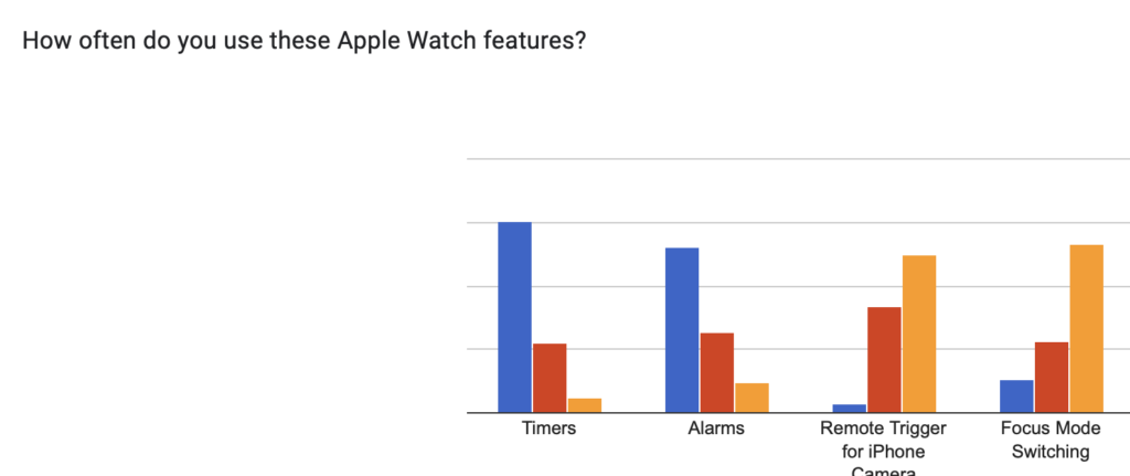
The data below speaks for itself, but there were a few items that stood out to me:
- The Apple Watch users are overwhelmingly satisfied with their watches. Those of us on the edges forget that most people just love their Apple products.
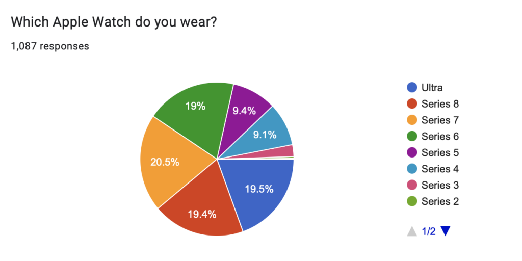
- Many People (~40%) are wearing older Apple Watches (3+ years). At the same time, the Ultra is very popular (19.5%).
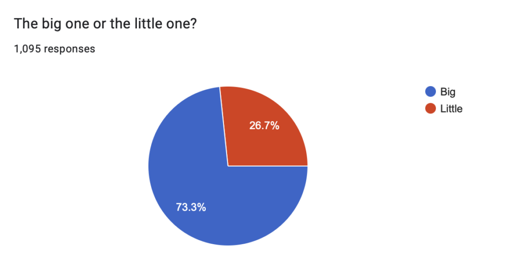
- The big watch is much more popular than the small one. I know there are more men than women in my audience but I also suspect my gang thinks about battery life more than most consumers.
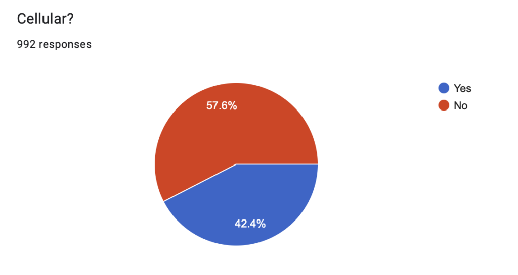
- The cellular watch is more popular than I thought it’d be. I try not to think about the money I spend to have a cellular watch vs. the amount of actual usage it gets.
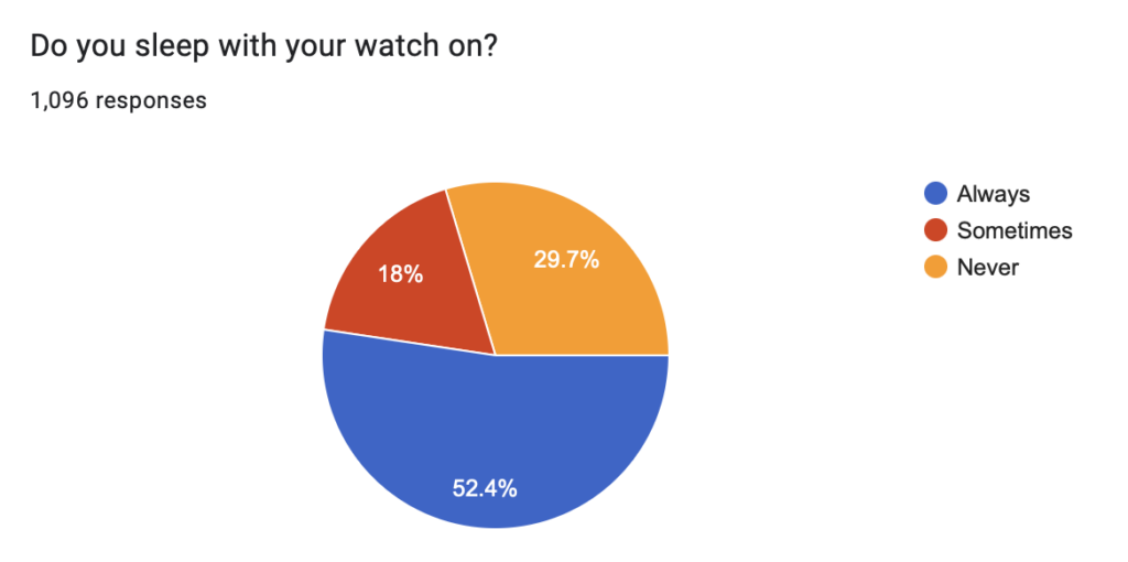
- Seventy percent of those responding sleep with the Watch on at least sometimes. That is a much bigger number than I expected.
- The feature usage numbers were not that surprising, except for Focus modes. I expected more people to be using the watch for Focus Mode shifting, and the numbers didn’t bear that out. I’ll be doing my next survey on how many people are actually using Focus Modes.
- I got lots of email and comments from people using their Apple Watches in unique ways. While for most the watch is a time, notification, and activity device, for some users it’s a lot more.
Written by David Sparks
I write about getting more from your Apple gear. If this was useful, go deeper in the Labs or grab the weekly newsletter.