Happy Friday!
It’s shipping week! This week, we got the release of all of Apple’s operating systems, and today, I’m guessing a bunch of you are taking delivery of new iPhones and Apple Watches. The new iPhone Pro is the one that has me the most interested.
The iPhone Pro always leads the way with Apple’s design and features. While it looks similar to last year’s model, some significant differences exist. The body material has changed to titanium. All early reviewers are commenting on just how much lighter it feels, and Dr. Drang has an interesting explanation as to why. Not only is titanium a lighter material, but it’s also because that weight change occurs at the edge of the device, where we most acutely notice weight changes.
In addition to the weight loss, people will naturally be attracted to the texture, feel, and look of titanium over the prior stainless steel. That’s certainly been my experience with the watch.
Titanium isn’t the only design change. This new phone is more rounded than the prior square-edged generation. It’s a small change (and not as extreme as the “bar-of-soap” design from three years ago), but you will perceive it when you hold one.
Likewise, the new iPhone Pro is the introductory platform for significant changes in computational photography. Apple’s cooked up a way to combine the light gathering of a 12-megapixel image with the detail of a 48-megapixel image to give users a superior-to-both 24-megapixel image. The iPhone camera sells iPhones, which motivates Apple to make strides each year, but I also think it is a point of pride. They want to make the best camera. Period.
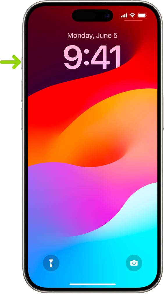
The other significant change is the removal of the Ring/Silent switch and the addition of an Action button. I am very interested in ways to use this button, and I’ll be publishing more on this going forward. However, I’d like to hear your intention for the Action Button. So, I’ve made a short poll. I’d appreciate it if you took a moment to reply so we can see how power users are looking at this new feature.

Either way, many of us will get our hands on the future today.
In the News
- This week is all about the new hardware and software. Next week will be similar as macOS Sonoma gets released on Tuesday. That very fact is notable news. It’s been a while since Apple could ship all of its operating systems in such proximity. All of this while they are also heads down on visionOS. Impressive.
- The other news item that made me grin this week was Intel announcing they need “another year” to make chips like Apple. And they’re not kidding. They’re talking about chips similar to Apple silicon, with combined memory and graphics (like Apple silicon). If you can’t beat them, join them. I think it is a smart move by Intel, though I doubt they’ll catch Apple soon. Apple is not standing still here.
Regardless, enjoy your new software and hardware, gang.
Your pal, David
p.s. The Obsidian Field Guide Plus Edition webinars are coming out great! We’ve already done two of them, and those videos are getting added to the course soon. There are a bunch more coming. If you’d like to get in on it, use code OBSIDIANGO for 10% off my new Field Guide through the weekend.
