My thanks to MacSparky’s sponsor this week, SaneBox, for maintaining inbox sanity. Have you ever counted how many emails you receive in a day? Let’s just go with a lot. SaneBox does a nifty job of taking your emails and putting them into useful buckets so you won’t even see them in your inbox, saving you time and energy. Spend your attention and keep your focus on your more important tasks. SaneBox will handle the non-essential emails until you’re ready to deal with them. Train SaneBox to have your unimportant emails sent to a folder, like SaneLater, and SaneBox will summarize them in a digest, where you can quickly bulk-process them.
A few months ago, I did an extended Friends of Dave interview with Sal Soghoian about the new voice commands for OmniFocus. This has been in the MacSparky Labs for a few months, and several members have been using this cool feature. This is one of those things I wanted to make sure everyone can see, so here it is.
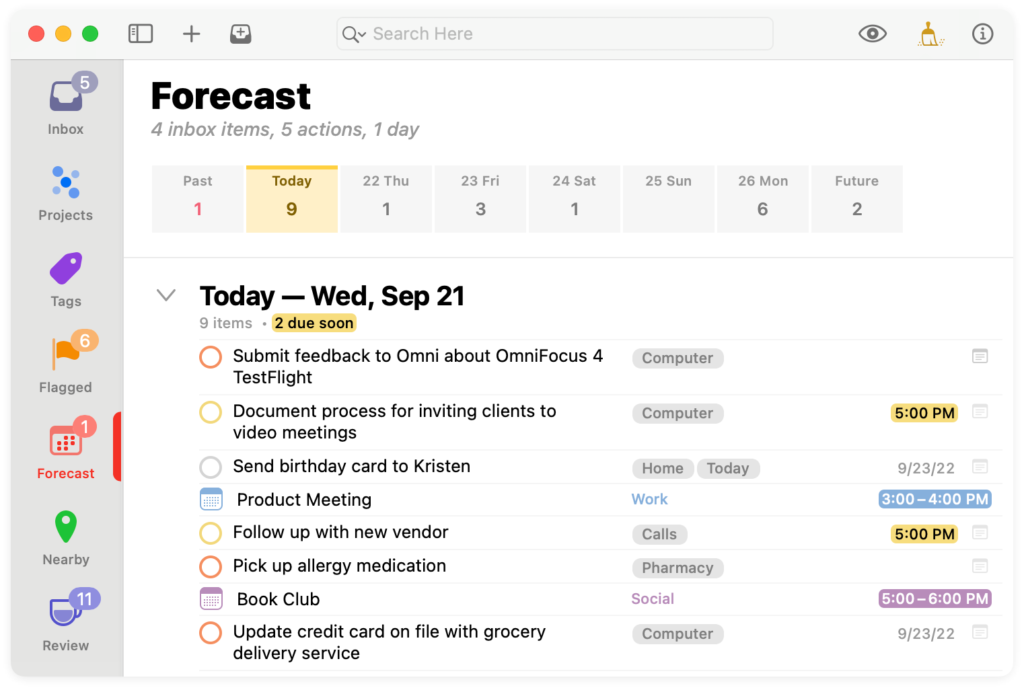
The OmniFocus team has been hard at work on OmniFocus 4 for some time now. Recently they announced the public release of the Beta for OmniFocus 4 for Mac. There are several significant improvements coming with OmniFocus 4:
Feature Parity
With OmniFocus now built around SwiftUI, Mac, iPhone, and iPad features are essentially in sync. Generally, you get all features everywhere. For example, you can now get location-based tags on the Mac for the first time.
New Design
The new design is lighter than previous iterations of OmniFocus. There’s more white space, and the UI is much cleaner. Nevertheless, it still feels like a flavor of OmniFocus.
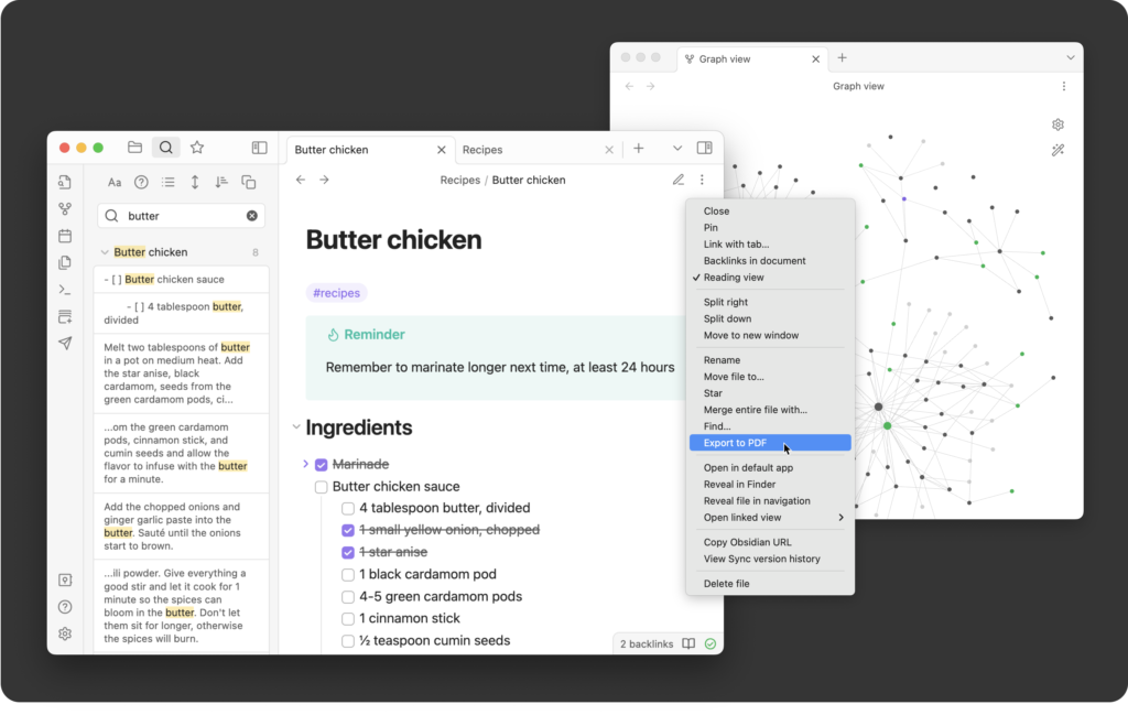
Obsidian, the personal management and idea connector that we have all been losing our collective minds over, is now officially out of beta with their release of version 1.0. Congratulations to the small Obsidian development team that made a very big app.
While I don’t use Obsidian for everything, I’m in it daily and use it for many things. Here are some of my favorite things about this application:
The file format is nothing but a folder full of markdown files. While you add some extra syntax to get those additional features from Obsidian, it is all universal and future-proof. If Obsidian were to go away, you’d still have all your data in a usable format.
Despite the universal nature of the files, you can do nearly anything with this application that involves words. At this point, there are 25 core plug-ins in the 668 additional community plug-ins. You can use this app to take a few notes or build an entire system around it.
The Obsidian community is fantastic. The people using the app are generally enthusiastic about it and friendly to people coming into it. The folks who decided to build on the Obsidian API to develop their plug-ins are intelligent and generous.
The Obsidian developers get it. They are entirely transparent and constantly working on improving the application. I particularly love how they publish for their Trello board so you can see what they are working on next.
I love this app. I’m actively producing a new Field Guide about it right now. If you’ve been waiting for Obsidian to leave beta, you’ve got no further excuses.
I’ve spent a lot of time thinking about Reminders with its latest additions. Reminders is an excellent application and continues to evolve, but hasn’t come far enough for me to adopt it. In this video, I explain why…
I’ve made no secret of my dissatisfaction with the Apple Watch faces. As someone who wears an Apple Watch every day, I can tell you things I don’t like about every available watch face. I’m not alone in the sentiment. Zac Hall wrote an article over at 9to5 Mac arguing that Apple needs to give users more customization to the existing Apple Watch faces. Amen.
I agree with everything Zac wrote, but I also have a few additional points from a fifty-plus-year-old nerd.
Complications Need to Become Easier to Read
For instance, the current corner date complication puts the day of the week in large text and the day of the month in small text. Why? Most people that need the date on their watch need the day of the month. Also, why not an option with an even bigger number that is the day of the month and forego the day of the week altogether?
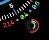
Another example is where they put in small bits of text in a complication in addition to an icon, like the Activity Rings. I like complications, but I feel like the inclusion of the exact count for each ring on the face isn’t necessary. Why not an option with just rings?
Watch Hands
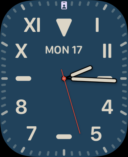
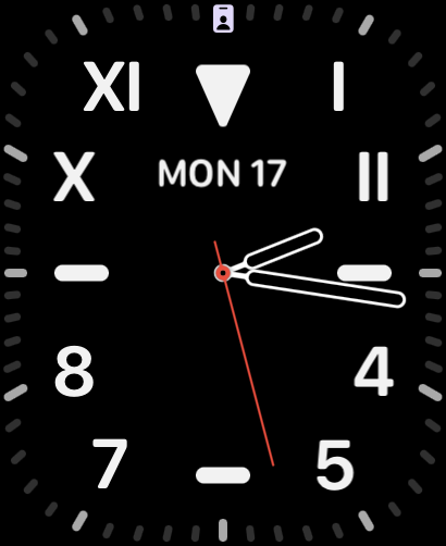
Many faces have hands that blend into the background. For example, most of the color variations of the California face have hands that are the same color as the background. When you want to check the time but have to spend time trying to find the hands on your watch, that’s bad. There are exceptions in the California face, like Navy Blue (pictured), but they should all have at least an option to be this readable.
Making more customizable Apple Watch faces seems like such low-hanging fruit that it baffles me why Apple hasn’t done it yet. I fully realize the “get off my lawn” tone this article sets, but it seems like every new iteration makes reading watch harder for anyone over 25. If Apple gave users more granular controls over watch faces, we could build faces we’d like a lot more.
Happy Monday! We are now heading into a period where new Apple announcements (MacBook Pro, Mac mini, iPad Pro, and standard iPad) seem imminent. Make sure to keep your friends from buying any of those things for the next few weeks…